 By Caleb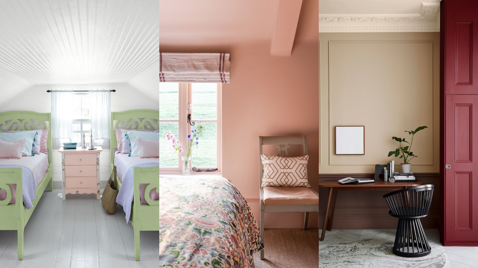
The colors we choose for our home do much more than change its appearance. They influence how each room feels, affect our mood, and even impact how large or small a space appears. A carefully chosen color palette can make a home feel warm, welcoming, bright, and comfortable, while the wrong combination may leave rooms feeling dark, cramped, or disconnected.
Choosing paint colors can also feel overwhelming. With hundreds of shades available, it’s easy to second-guess every decision. Fortunately, creating a beautiful home doesn’t require professional design experience. By understanding how colors work and considering the purpose of each room, we can confidently choose shades that fit our lifestyle and personal taste.
In this guide, we’ll explore practical tips for selecting the right colors for every room, helping us create a home that feels balanced, comfortable, and timeless.
Why Color Matters in a Home
Color affects both the appearance and atmosphere of a room.
The right colors can:
- Make small rooms appear larger
- Create a relaxing atmosphere
- Increase brightness
- Make large rooms feel cozier
- Highlight architectural features
- Improve the flow between rooms
- Reflect our personal style
Rather than following trends, it’s better to choose colors that suit the way we use our home every day.
Start With Natural Light
Before selecting any color, pay attention to how much natural light the room receives.
Rooms filled with sunlight often make colors appear brighter and warmer.
Rooms with limited natural light may make the same color look darker.
Observe the room at different times of day.
Morning, afternoon, and evening light can completely change the appearance of paint.
Testing colors under your home’s actual lighting helps avoid surprises after painting.
Understand Warm and Cool Colors
Colors generally fall into two broad categories.
Warm Colors
Warm shades create a cozy and welcoming feeling.
Examples include:
- Soft beige
- Cream
- Warm white
- Terracotta
- Light peach
- Warm taupe
These colors work well in living spaces where families gather.
Cool Colors
Cool colors create a calm and refreshing atmosphere.
Examples include:
- Soft blue
- Light gray
- Sage green
- Pale lavender
- Cool white
These shades are often popular in bedrooms, bathrooms, and quiet workspaces.
Neither choice is better. It depends on the mood we want each room to create.
Consider the Purpose of Each Room
Before choosing a color, ask how the room will be used.
A busy family room may benefit from warm, welcoming tones.
A bedroom often feels more relaxing with softer colors.
A home office might need shades that encourage focus without feeling distracting.
Matching colors to the room’s purpose helps create a more comfortable living environment.
Choosing Colors for the Living Room
The living room is usually the heart of the home.
It’s where we relax, entertain guests, and spend time with family.
Popular choices include:
- Warm white
- Soft beige
- Light gray
- Greige
- Cream
- Soft earth tones
These colors create a welcoming backdrop while allowing furniture and decorations to stand out.
Accent colors can be introduced through cushions, rugs, artwork, and curtains rather than bold wall colors.
Choosing Colors for the Kitchen
The kitchen should feel bright, clean, and inviting.
Light colors often help make kitchens appear larger and more open.
Popular options include:
- White
- Light cream
- Soft gray
- Sage green
- Light blue
- Pale beige
Natural wood cabinets also pair beautifully with neutral wall colors.
If you enjoy colorful kitchens, consider adding color through accessories instead of painting every wall a bold shade.
Choosing Colors for the Dining Room
Dining rooms often benefit from warm, comfortable colors that encourage conversation.
Good choices include:
- Soft beige
- Warm gray
- Muted green
- Earthy brown tones
- Cream
These colors create a welcoming atmosphere without feeling overwhelming.
Simple lighting can further enhance the warmth of the space.
Choosing Colors for the Bedroom
Bedrooms should promote rest and relaxation.
Soft, calming colors usually work best.
Popular bedroom colors include:
- Light blue
- Sage green
- Soft gray
- Warm white
- Pale lavender
- Gentle beige
Avoid using too many bright or highly saturated colors throughout the room, as they may feel overly energetic.
Instead, add personality through bedding, artwork, or decorative accessories.
Choosing Colors for Children’s Bedrooms
Children’s rooms should feel cheerful while remaining comfortable.
Instead of extremely bright walls, consider softer shades that can grow with the child.
Good choices include:
- Soft yellow
- Light green
- Sky blue
- Gentle pink
- Warm white
Bright colors can still be introduced through toys, bedding, storage bins, and decorations.
This makes it easier to update the room as children grow.
Choosing Colors for the Bathroom
Bathrooms often look best with fresh, clean colors.
Popular choices include:
- White
- Light gray
- Pale blue
- Soft green
- Cream
These colors reflect light well and create a clean appearance.
Natural materials like wood shelves or woven baskets add warmth without overwhelming the space.
Choosing Colors for the Home Office
A productive workspace should feel calm without becoming boring.
Neutral shades often reduce distractions.
Popular office colors include:
- Light gray
- Sage green
- Soft blue
- Warm white
- Beige
Good lighting and organized furniture play just as important a role as wall color.
Choosing Colors for Hallways
Hallways connect different areas of the home.
Using light, neutral shades helps these spaces feel open.
Consider:
- Soft white
- Cream
- Light gray
- Pale beige
Keeping hallways visually simple creates better flow between rooms.
Choosing Colors for Entryways
The entrance creates the first impression of the home.
Choose colors that feel bright and welcoming.
Light neutrals often work well because they reflect available light and make smaller entrances appear larger.
Adding colorful artwork or decorative pieces can provide personality without overwhelming the space.
Neutral Colors Never Go Out of Style
Neutral colors remain popular because they’re flexible and timeless.
Examples include:
- White
- Cream
- Beige
- Gray
- Taupe
- Greige
They complement almost any furniture style and make future decorating updates much easier.
Changing cushions or artwork is far simpler than repainting every room.
Use Accent Colors Wisely
Accent colors add personality without dominating a room.
Instead of painting every wall a bold color, consider using brighter shades in:
- Cushions
- Rugs
- Curtains
- Artwork
- Decorative vases
- Throws
This approach allows us to refresh a room without major changes.
Keep Colors Consistent Throughout the Home
Every room doesn’t need the same color.
However, maintaining a consistent overall palette creates better flow.
For example, similar neutral shades can connect living areas while allowing each room to have its own accent color.
Consistency helps the home feel larger and more balanced.
Test Paint Before Making a Final Decision
Paint colors often look different on walls than they do on small sample cards.
Before painting an entire room:
- Test a sample on the wall.
- View it during the morning.
- Check it in the afternoon.
- Look again at night.
Lighting changes throughout the day, and seeing the color under different conditions helps avoid disappointment.
Consider Your Existing Furniture
Wall colors should complement the furniture you already own.
Look at:
- Flooring
- Cabinets
- Sofas
- Curtains
- Rugs
- Wooden furniture
Choosing colors that work with existing materials creates a more harmonious space.
Don’t Follow Every Trend
Trendy colors come and go.
While they’re fun for accessories, permanent features like walls often benefit from more timeless choices.
If you enjoy current trends, use them through smaller decorative items that are easier to replace.
This keeps the home looking fresh without requiring frequent repainting.
Common Color Mistakes to Avoid
Many decorating problems come from a few simple mistakes.
Avoid:
- Choosing paint before furniture
- Ignoring natural lighting
- Using too many bold colors
- Painting every room a completely different color
- Forgetting to test paint samples
- Copying colors without considering your own home
- Overlooking ceiling color
- Using dark colors in very small rooms without enough light
Simple planning helps prevent expensive mistakes.
Easy Tips for Choosing the Perfect Color
Keep these practical tips in mind:
- Start with neutral colors.
- Test samples before painting.
- Consider how each room is used.
- Let natural light guide your choices.
- Add color through accessories.
- Maintain a consistent palette.
- Choose comfort over trends.
- Think long-term rather than short-term fashion.
These simple habits make color selection much easier.
Final Thoughts
Choosing the right colors for every room isn’t about following the latest decorating trends or copying someone else’s home. It’s about creating spaces that feel comfortable, practical, and suited to the way we live every day. By considering natural light, the purpose of each room, existing furniture, and a consistent color palette, we can make every part of our home feel more inviting and connected.
The best color choices are often the ones that stand the test of time. Neutral foundations paired with carefully selected accent colors provide flexibility, allowing us to refresh our décor without completely changing the space. With thoughtful planning and a little patience, we can create a home that feels bright, welcoming, and enjoyable for years to come.
Frequently Asked Questions
What color works in almost every room?
Soft white, warm beige, light gray, and greige are versatile colors that suit most homes and decorating styles.
Should every room be painted the same color?
Not necessarily. Using complementary colors with a consistent overall palette creates variety while maintaining visual flow.
Are dark colors always a bad choice for small rooms?
No. Dark colors can create a cozy atmosphere, but they usually work best when paired with good lighting and thoughtful décor.
How many colors should we use throughout the home?
Most homes feel balanced with two or three main colors supported by a few accent shades.
Why should we test paint before buying?
Lighting, flooring, and furniture all affect how paint appears. Testing samples helps ensure the final result matches expectations.
 Tiberius